The Grand Prix d’Amérique decodes its logo
With its logo openly referencing the Statue of Liberty, the Grand Prix of America claims a distinctly American symbol and an international identity with the hope that its logo will, over time, become as recognized as the logo of the famous Indianapolis Motor Speedway.
While Bernie Ecclestone was still recently doubtful about the realization of the Grand Prix of America, scheduled from 2013 on the banks of the Hudson River in New Jersey, with Manhattan’s skyscrapers in the background, the organization of the event has equipped itself with a logo, a communication tool par excellence, which was unveiled during Sebastian Vettel’s demonstration on the future Port Imperial circuit last June.
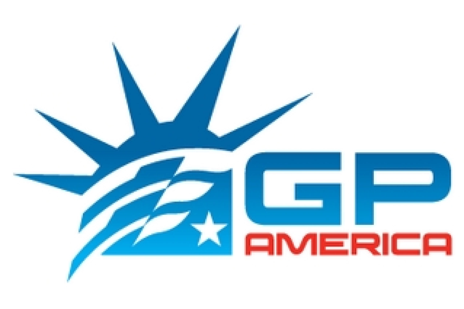
With a dominant blue color and mixing a checkered flag with the headdress of the Statue of Liberty, the Grand Prix of America logo seems to play with clichés, given how much these two themes have been overused. However, for Paul Pfanner, president of the communication agency *Racer Media and Marketing* in charge of the project, the reference to the famous New York statue was unavoidable: The constant, in all the projects, was the reference to the Statue of Liberty. It is located between the center of New York [Manhattan, editor’s note] and New Jersey, something that the entire region and the country can claim as an identity. It immediately symbolizes America for people. It is also something international: it is a gift from France to our country, which is an ironic metaphor since road racing began in France and today the headquarters of the FIA is located in Paris.
But the Statue of Liberty also reminds us that the United States is—or was?—a land of welcome. Used as a beacon to guide ships to the port of New York from 1886 to 1902, the New York monument is also a symbol, for the many immigrants who flocked to the Big Apple at the beginning of the 20th century, of the success of their exile, reflecting all the possibilities that opened up to them, even if many became disillusioned upon discovering the reception conditions on Ellis Island. The Grand Prix of America claims a truly American identity—the Statue of Liberty being one of the symbols most frequently associated with the United States worldwide—but also an international identity, with New York being the quintessential multicultural metropolis, with communities from all corners of the globe.
But because the Statue of Liberty is a symbol featured in many logos, the task was all the more difficult, as explained by its graphic designer, Aaron Justus, who notably studied more than twenty logos referencing the New York monument to ensure his design was unique: « The challenge was to use such a symbolic element but not fall into cliché or make it look like clip art. […] It took me four full days. I found the elements, created some, assembled them, and shaped the logo like a piece of clay to ensure the proportions were right. Suddenly, everything came together. » And the designer added: « If you overlay the logo on the face of the Statue of Liberty, the flag fits perfectly with the hair, and one of the checkers, along with the star, aligns perfectly with her eyes. There’s a connection that may not be obvious to everyone, but it’s really cool to see how it all comes together. »
Tested among the employees of the agency Racer Media and Marketing, the logo generated enthusiasm: “It doesn’t always happen like that,” says Aaron Justus. “It was a rare fact because we really liked it internally and no one rejected it. It’s just not normal, but when people saw it, they thought that was it: it made sense.”
But the logo of the Grand Prix d’Amérique also had to meet practical requirements: « It must be as powerful in a single color as it is in multiple colors. At first glance, you must understand what it is trying to convey. And it must be reproducible on different media and formats. It must be adaptable. »
But beyond that, the ambitions expressed by Pfanner for the Grand Prix of America’s logo speak volumes about the determination to make the New York event an essential fixture on the Formula One calendar and perhaps even in auto racing: « Over time, people will look at the symbols of the Grand Prix of America as they look at the logo of the Indianapolis Motor Speedway. We believe this logo can establish itself as one of the remarkable identities in Formula One. »
By the way, on that note, will you be able to recognize the circuits, listed on the 2011 and/or 2012 calendars, associated with the 16 logos below?